
It's Design. But You Can Call It 'I Like to Use My Project Management Tool.'
Good design isn't decoration. From the birth of the graphical interface to the dozens of tools we tested before building our own, how a tool looks and feels directly shapes whether teams actually use it — with real screens from HourSquad. — July 24, 2026 · Herculano Swerts

In 1973, Xerox PARC unveiled a computer called the Alto. It had a bitmapped screen, a mouse, overlapping windows, and icons — nearly every visual convention we now take for granted in software. It was, by most technical measures, years ahead of anything else in the industry.
It also went almost nowhere commercially.
Xerox's own attempt to sell the technology, a machine called the Star, launched in 1981 at a price of roughly $16,000 and failed to find a market. The underlying ideas were sound. What was missing was everything around them: the polish, the accessibility, the sense that an ordinary person could sit down and simply understand what to do.
Three years later, Apple launched the Macintosh. It used many of the same underlying concepts PARC had pioneered — windows, icons, a pointer, direct manipulation. But Apple wrapped them in something Xerox never quite delivered: an interface designed to feel approachable, even delightful, to someone who had never touched a computer before. The Macintosh became the first mainstream computer built around a graphical interface, and it fundamentally changed who computers were for. Command-line interfaces, however efficient, had kept computing in the hands of specialists. The graphical interface — visual, intuitive, forgiving — is widely credited with opening computing to everyone else.
The technology at PARC and at Apple was, in large part, the same technology. The difference that mattered was design.
Why this isn't just a nostalgic story about the 1980s
There is a well-documented phenomenon in human-computer interaction research called the aesthetic-usability effect. First studied in 1995 by researchers at the Hitachi Design Center, who tested 26 variations of an ATM interface with 252 participants, the finding was clear and has been replicated many times since: people consistently rate visually appealing designs as easier to use, even when the actual functionality is identical to a less attractive version.
A later study using a simulated mobile phone interface found something even more concrete: participants using a visually appealing version of the interface completed tasks faster than participants using a functionally identical but visually unappealing version. The aesthetics didn't just change how people felt about the tool. It changed how well they performed with it.
This matters enormously for software that teams are expected to use every single day. A time tracking or project management tool isn't judged once, in a demo. It's judged every morning when someone opens it, and that first impression — clean or cluttered, calm or chaotic — shapes whether people engage with it willingly or treat it as one more chore to get through.
What this looks like in practice
Good design in a professional tool isn't about decoration. It's about a handful of specific, deliberate choices that compound into something people actually enjoy opening.
Color that carries meaning, not just brand identity. A budget that's on track and a budget that's about to be exceeded should not require reading a number to tell apart. When color is used consistently — teal for healthy, amber for attention, and nothing else competing for that signal — a project manager can scan a dashboard and understand the state of ten projects in the time it takes to glance at the screen.
Typography that respects the eye doing real work. A dashboard someone reads for two minutes a day can survive poor typography. A dashboard someone reads for two hours a day cannot. Font weight, size, and spacing aren't cosmetic choices in a tool built for daily use — they're the difference between information that's easy to scan and information that requires effort to parse, multiplied across every single day a team uses the product.
Charts that show the one number that matters, not every number available. It's tempting to build a dashboard that displays everything a database can produce. It's much harder — and far more valuable — to build one that shows a project manager exactly what they need to know first: are we on budget, is anyone overallocated, what changed since yesterday. Restraint in what a screen shows is itself a design decision, and it's usually the hardest one to make.
Interfaces that get out of the way of the task. We wrote recently about muscle memory and how repetition turns a deliberate, effortful action into an automatic one. Thoughtful design accelerates that process. A confusing entry flow keeps every action at the level of conscious thought — where does this go, what does this button do — long after the habit should have become automatic. A clean, predictable interface lets the habit form faster, because there's nothing left to figure out.
What dozens of tools taught us about design
I've written before about spending two decades migrating between project management systems, searching for one that actually fit how professional services teams work. What I haven't emphasized as directly is how much of that search came down to design specifically, not just missing features.
Across those years, I tested dozens of tools. Many of them were functionally capable — they could log hours, track projects, generate reports. But a striking number of them were genuinely unpleasant to open every morning. Dashboards crowded with every metric the database could produce, with nothing telling you which one mattered today. Color used decoratively instead of meaningfully, so a red number and a blue number carried no more information than a black one. Typography dense enough that a two-minute check-in became a five-minute squint.
That accumulated frustration shaped how we approached HourSquad's design directly. Not as an afterthought layered on top of the features, but as one of the product decisions we spent the most time getting right.
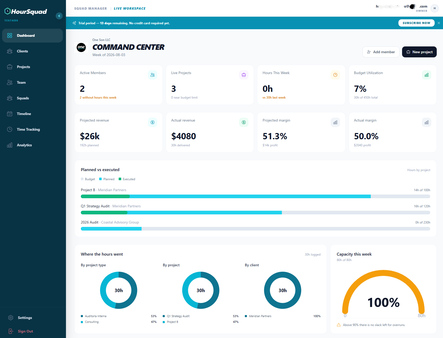
HourSquad's dashboard: a handful of numbers that answer the questions a manager actually asks first, not everything the database can produce.
The dashboard above is a direct application of restraint as a design choice. Active members, live projects, hours logged this week, budget utilization — four numbers, not forty. Anyone who has opened a cluttered analytics screen first thing in the morning knows the relief of a dashboard that tells you what matters before you've had coffee.
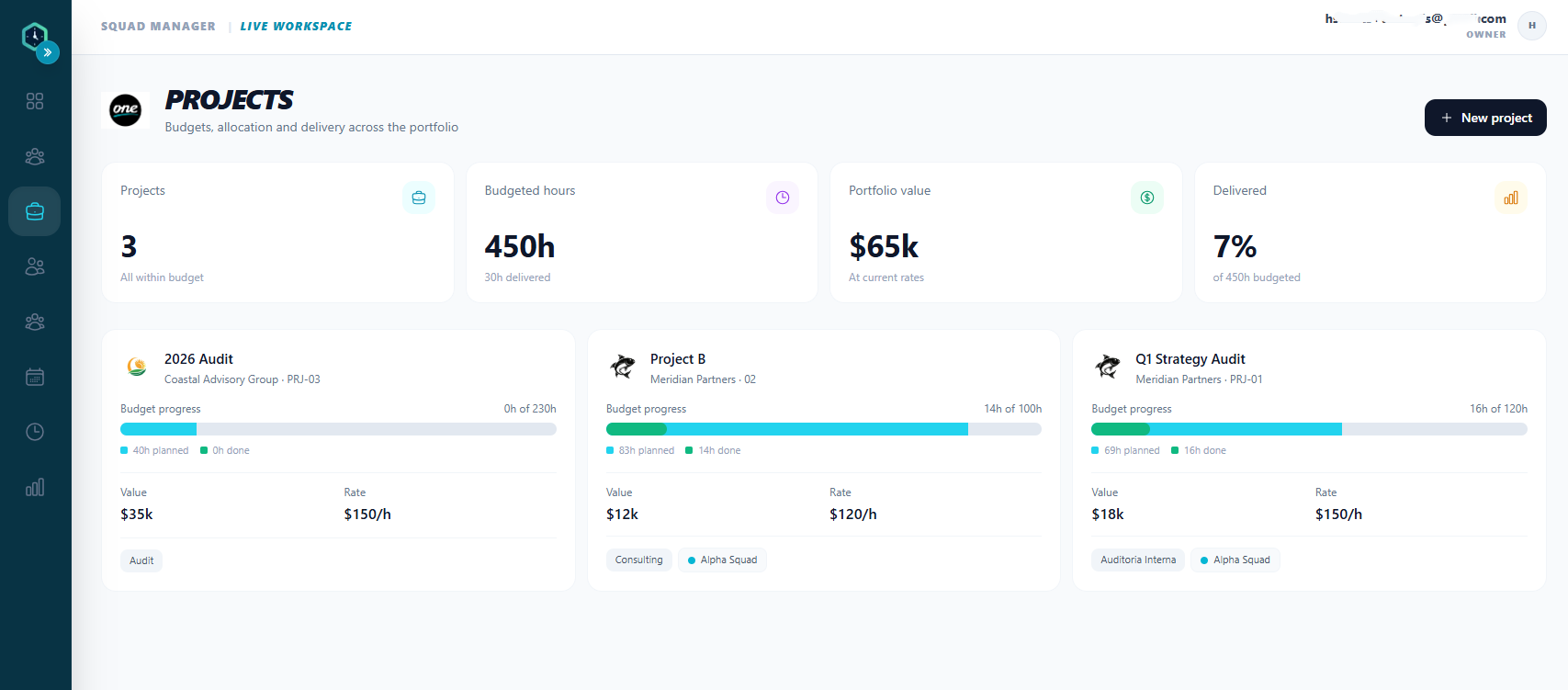
Planned versus executed hours, with color carrying the signal — teal for on track, amber the moment a project moves past its budget.
This is the color-with-meaning principle in practice. The progress bar doesn't just show a percentage — it changes color specifically when a project crosses from healthy to concerning. A project manager scanning ten of these doesn't need to read every number to know which ones need attention right now.
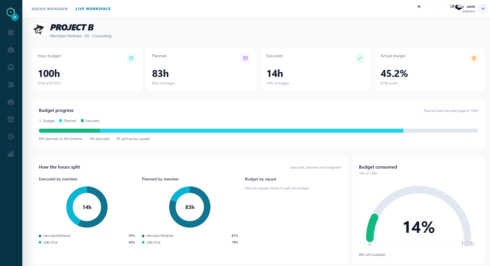
Simple, legible charts — the same underlying hours, viewed by project type, by project, and by client, without asking the reader to build the picture themselves.
None of these screens are visually loud. That's deliberate. The goal was never to impress someone in a five-minute demo — it was to build something a project manager could open forty times a week without it ever becoming tiring to look at.

A tool your team will actually want to open.
HourSquad was designed with the same attention to color, typography, and clarity that this article describes — because the best time tracking tool is the one your team doesn't resist using.
Try HourSquad free for 28 days →
The connection to productivity is not indirect
It's worth being precise about the mechanism here, because "good design improves productivity" can sound like a vague marketing claim rather than something real.
The connection works through adoption, not magic. A poorly designed tool doesn't fail because it lacks features. It fails because people avoid it — they delay entries, they skip fields, they revert to spreadsheets and sticky notes for the parts that feel like friction. The tool with the most features in the world produces nothing if the team doesn't actually use it consistently.
A well-designed tool removes that resistance. People open it because it's pleasant, not because they've been told to. They complete entries fully because the flow makes sense, not because a manager is chasing them down. And because the data going in is more complete and more timely, the information coming out — budget status, squad allocation, planned versus executed hours — becomes something the team can actually trust and act on.
Design, in this sense, isn't the opposite of substance. It's one of the main paths to it.
The lesson from 1984, applied to project management software
The Macintosh didn't win because it was more powerful than the alternatives. In many technical respects, it wasn't. It won because it was the version of a genuinely useful technology that people actually wanted to sit down and use — the one that turned a specialist's tool into something approachable enough for anyone.
The same principle applies, at a much smaller scale, to the tools professional services teams use to track their time, manage their budgets, and understand their projects. A powerful tool nobody enjoys opening will always lose, in practice, to a well-designed one that people actually use every day.
That's not a soft argument for pretty interfaces. It's the same argument researchers have been documenting since the Hitachi ATM study in 1995, and the same one Xerox learned the hard way with the Star: the technology was never the whole story. How it feels to use it always was.
It's design. But you can call it "I like to use my project management tool." Either way, it's the same thing.
See what a well-designed tool feels like.
HourSquad combines real-time budget visibility, squad management, and time tracking with an interface built to be genuinely pleasant to use every day.
$5/user/month. No usage fees. No surprises.
Try HourSquad free for 28 days →
No credit card required. Cancel anytime.
Ready to put these tips into practice?
HourSquad gives your team real-time visibility into hours, squads, and budget execution.
28-day free trial. No credit card required.
Try HourSquad Free